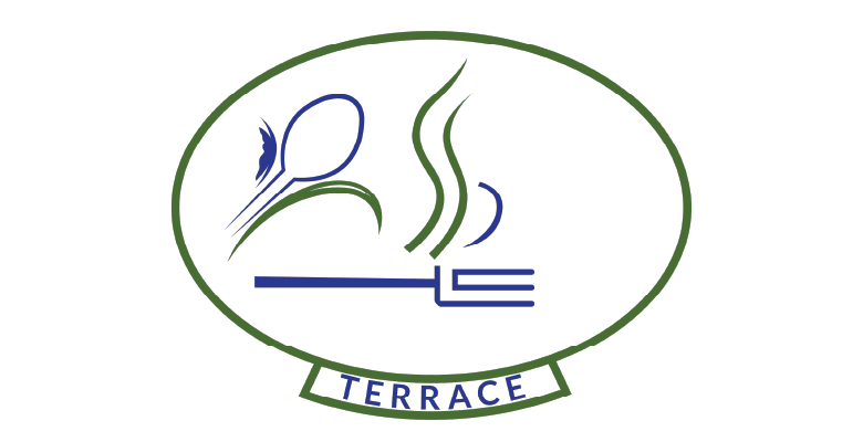
Congratulations to St. Paul's L'Amoreaux Centre tenant, Mr. Man Lok Chow, whose design was chosen to be the new logo for our Terrace Restaurant.
If you look carefully at Mr. Chow’s clever design, you will see the letters S P L C artfully drawn onto the logo. The rising steam lines represent the S and the P, while the fork at the bottom is shaped by the letters L and the C. The spoon on the left incorporates a part of the SPLC logo, and the overall shape of the Terrace Restaurant logo is meant to represent a plate.
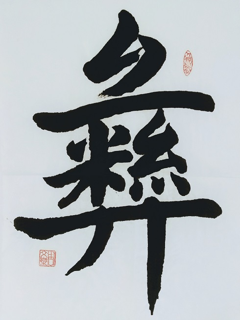
While this is Mr. Chow’s first time creating a logo, the 88-year-old has a life-long passion for Chinese calligraphy.
Since he was a boy, he was interested in calligraphy and practiced it, but it wasn’t until his retirement (he worked with Pfizer in Hong Kong for 30 years), that he was able to truly dedicate time to his art. His first real calligraphy class was through SPLC when he became a tenant in 2014.
Creating Chinese calligraphy, Mr. Chow says, requires a lot of patience, not to mention precision.
While the calligraphy classes had to pause because of the pandemic, Mr. Chow continues to create art on his own time. To stay active through the pandemic, he also tries to walk often and exercise on the balcony. He has grown children and grandchildren nearby who he continues to connect with by phone. His family and friends also regularly visit (at a distance) to deliver meals.
The logo Mr. Chow created will be used in the Terrace Restaurant on signage and stationery. Congratulations, Mr. Chow!
Thank you to all those who participated in the logo competition and those who took time to vote for the winning logo. It was a great competition with remarkably creative submissions.


